View from the Switchback, Rainbow Creek Trail (WiP), 9x16, oils on panel
(the lower third's barely been blocked in but I'm "in the zone" and all is progressing swiftly)
18 oil paintings on panel, 58 works on paper (drawings, watercolors, and illuminated maps), 73 photographs, 3 videos, and almost all of the text! That's where I stand with the new book (
The North Cascades: A Tale of Two Seasons) this week.
As things stand now I'll likely add two more panels and then turn my focus to selecting the final works on paper, photos, (maybe 2 dozen of each, I think) and videos. (Fewer of the latter -- maybe rounding it out to an even half dozen -- otherwise they can easily exceed a reasonable file-size limit for the book.)
More to come soon. (So, please stay tuned.)
A Word (or Two) About Custom Panels --
During my travel adventures I love to work on paper and panel. Both are versatile and compact. Un-cradled panels lend themselves particularly well to the rigors of working plein air. And Ampersand panels come in a wide variety of standard sizes that easel meet most artist's needs.
a 5"x14" panel (already toned) atop a 9"x16" panel
I also love to explore the creative potential of elongated rectangles (a format shape that is more common in oriental art and which I was introduced to while living in Taiwan many years ago.) And I especially find the elongated vertical and elongated horizontal formats of particular interest when working with landscapes.
Fortunately, the folks at Ampersand are particularly accommodating when it comes to the special needs of artists and were quite happy to produce custom panels for this project. You won't find my 9"x16" or 5"x14" panels in your local art supply shop or on any of the online retailers. But, if you've got something special in mind, you might visit the Ampersand website then click on "Products" > "Gessobord" > "Standard Sizes". Then scroll down to the bottom of the chart and click on the "For information about custom sizes please contact us." link and let them know what you need. Turn-around on orders is about two weeks, once the order has been placed. (They'll keep you informed at each stage of the process.) And customer service is outstanding!
Stay tuned for a follow-up article on a special project with
really over-sized custom panels (Works that run 80" in width qualify as "over-sized", don't they?) from the folks at Ampersand.
And A Few More Words About Toned Panels --
As a general rule I prefer not to begin my paintings with a white surface. I find the glare under our Southwestern sun almost painfully harsh. And it's next to impossible to accurately judge the eventual hue and, in particular, the final value of color placed on a white surface. Any color (
every color) will appear darker against a white background, and will appear to lighten in value as the white surface is covered with paint.
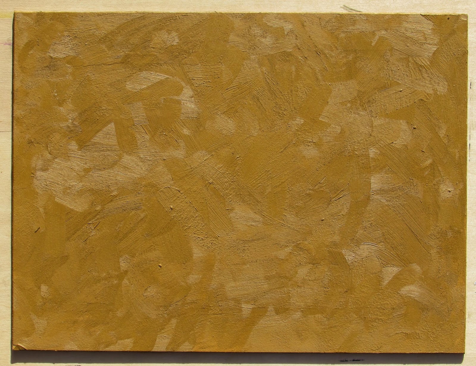
a standard 9"x12" panel toned (and textured) with Gamblin Yellow Ochre
For years I was in the practice of toning my blank canvases and panels with Gamblin Artist's Oil Colors Yellow Ochre. (I am particularly fond of how the ochre compliments the bright cobalt blue our predominantly cloudless Texas skies.) But, when my travels began taking me to places that experienced more variety in their weather I started experimenting with a more neutral (and a little more versatile) toning color.
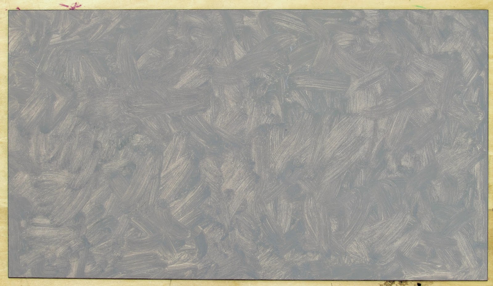
After several experiments I have now been won over by Gamblin's Torrit Grey. First, because when I apply Torrit Gray with a variable brush pressure the paint film actually takes on a polychromatic appearance! That is, slightly thicker areas appear cooler and slightly "greener" (This can be explained by the fact that the dominant pigment in this mixed gray is phthalocyanine green.) and thinner areas appear to be warmer -- almost earth-toned (likely caused by simultaneous contrast.)
the range of tone and temperature in the Torrit Gray is due solely to
variation in thickness of the paint film
And the second reason I like Torrit Gray so much? It's
free! If you aren't familiar with the Gamblin line of oil paints this may come as a surprise. But the story goes like this: each year Gamblin cleans the accumulated pigment out their Torrit air filters (These filters protect their employees from the potential hazards of breathing pigment particles.), mix the pigments with linseed oil, and give the paint away to their customers (through their retail distributers.) (Good for their employees, good for the environment, good for oil painters everywhere.)
Oh, and since the paint varies in value (from a middle tone neutral gray to a dark charcoal) from year to year, the company now dates each tube for artists who wish to build a collection of "vintages." (My pre-dating tubes of 2006 Torrit are a buttery middle-tone.)
Cheers!