Tuesday, April 30, 2013

Spring Wildflowers of the Lone Star State (Exaclair, Part 2)

suitably attired in my Hawaiian wildflower camo shirt

Despite the ongoing drought in Texas we managed to get enough rain in March and early April to bring out some of our colorful spring florals. Combine that with sunrise by 7ish each morning and temperatures in the 60s-80s range most days and you can probably understand why I'm thrilled to answer the siren song of the sketching muse every day now. 

On top of all that we celebrated Earth Day this past week and the materials from Exaclair have been pleading for my attention. (I know, it's a tough job but someone's gotta do it. Right?)

cream colored Clairefontaine paper

My first outing was with an orange Rhodia Webnotebook, kit bag, and camp stool. My intention was to do some pen & ink work. (This was, after all, satiny-smooth Clairefontaine -- THE fountain pen-friendly paper, yes?) But as soon as I began my preliminary underdrawing I discovered that this paper loves graphite too. It responded to the slightest variations in pressure and easily captured the pencil's full tonal range -- from subtle nuance to bold statement -- without the need for excessive pressure.

Limestone Gaura (Gaura calcicola)
cream colored Clairefontaine paper

I am a colorist by inclination, and generally prefer to work on a scale that fills both hands. But the intimate 3.5"x5.5" scale of the Webnotebook and the graphite-friendly surface of its paper mean that one need never miss a spontaneous opportunity. Every serendipitous surprise can be captured with ease. 

Verbena bipinnatifida
watercolor and graphite on white Clairefontaine

On a personal level, the larger size of the 148mm x 210mm cloth-bound Clairefontaine sketchbook is even more comfortable to work in for longer periods than the pocket-sized journals. And, while the 90g paper weight may be less than optimal for use with watercolor, it does handle modest washes without incurring problematic buckling. 

graphite on white Exacompta laid paper

Prior to the arrive of the sampler package from Karen Doherty at Exaclair, USA, in New York, I don't believe I had even read anything about the Exacompta product line. So, I was particularly surprised by the 148mm x 210mm Sketch Book, by the attention to detail (The paper's edges have been sealed with a silvery metallic coating to protect against moisture and airborne contaminants.), and by the classic laid pattern of the paper. 

in addition to our native irises, some popular garden varieties have gone feral
ink and watercolor on white Exacompta paper

Note for readers who may be unfamiliar with paper terminology: laid papers show the "chain" pattern of the screen they were manufactured on when held up to a light source, while wove papers (such as Clairefontaine) have a more uniform -- even smooth -- surface caused by the random interlocking or "weaving" of the paper fibers. 

watercolor and graphite on white Exacompta paper

Like the paper found in the Rhodia and Clairfonetaine journals, the Exacompta paper is both graphite- and ink-freindly. However, the Exacompta paper is heavier weight and handles watercolor washes without raising buckling/cockling issues. The surface texture is slightly toothier than that of Clairefontaine paper but without making wear on delicate nibs a cause for concern. 

watercolor and ink on ivory G. Lalo laid card

And then there's G. Lalo note cards. G. Lalo is without doubt one of the premiere stationary companies in the world but to suggest that this outstanding paper is "just" for letter and note writing is, I think, unnecessarily restrictive. The weight, surface texture, and sizing make this paper an equally beautiful choice for pen & ink drawings and watercolor painting. (In fact, the Lalo laid surface pattern make it unique among watercolor papers since most are wove rather than laid.) 

Kate and her sketch buddy

In Part 3 of the Exaclair series I'll delve more into the papers, structures, inks, and tools -- and share a few images too. Hope to see you there.

Cheers!


Sunday, April 28, 2013

Tricks of the Trade: Pen Fix•ations

A sampling of my pens -- some smooth as glass, some... not so much

I own several fountain pens, in part because I am fascinated by their history and technology, but primarily because I enjoy using them in my correspondence and my sketchbook -- when they're working properly.

If you own fountain pens and are like me you have some pens that write like a dream, smooth as butter. But you may also have one or two pens that feel more like a dull chisel trying to gouge its way into your paper rather than a buttery-smooth instrument of joy and delight. (And you have my heart-felt sympathy if your first and only experience with a fountain pen to date has left you thinking, "This is a piece of junk!")


Of course, I know there are pen masters out there who can smooth out our recalcitrant nibs for us. But, unfortunately, my pockets aren't deep enough to warrant spending much to get a $10, $50, or even $100 pen to "play nice." But, when the folks at FPGeeks teamed up with Brian Gray (of Edison Pen Co. fame) to offer a FREE online seminar on nib tuning and smoothing entitled Tweaks for Geeks.... Well, this was one opportunity that didn't have to knock twice.

Richard Binder's freebie blotter paper (with the vintage pen art) is the perfect size to pop into a Rhodia webnotebook 

OK, a quick qualifier: I said the workshop was free and watching Brian (either live on Saturday, or via YouTube now) is, indeed, completely free. If you want to participate hands on in the workshop you'll need a few items (and, of course, the FPGeeks/Brian Gray crew provide a free list in PDF form for your convenience). But if, like me, you don't possess the items you'll either want to watch the video first and decide whether or not to purchase the tools later, or you can simply follow the link Azizah, Stephen, Dan, and Eric have provided to Richard Binder's online store where for just $21 (plus $8 for Priority Mail service) you receive a complete Student Kit (including two practice pens) and 4 Tri-Grit Buff Sticks. These last two pieces are a brilliant addition as they free you up to learn from your mistakes (and isn't that the best way?) without risking that vintage heirloom you inherited from your father or grandfather.


The workshop itself runs 1 hour and 18 minutes and is divided into two parts: the first 15 minutes is a general introduction; and the remaining hour and 3 minutes is dedicated to testing the pen, checking/adjusting tine alignment, and nib smoothing. (Note: Brian highly recommends that ALL work on nibs be done in that order as most nib issues will, in fact, turn out to be tine alignment issues.)

one of my smooth-writing seminar souvenirs

By the time the workshop was over I'd checked all of my pens (over a dozen), smoothed out a few rough spots, and even had two new smooth-writing pens to give to my kids for their sketch kits. And the great news is that FPGeeks intend to add additional workshops covering other aspects of pen repair and enhancement in future. So, if you enjoy their first workshop, stay tuned for more fun soon!


Parting note: since I had several optical loupes on hand already, I opted not to purchase a new one for the workshop. If you already have one and you have a source of LOTS of light in your work area you'll probably manage fine. But, after watching the demonstration of Brian's preferred illuminated loupe and struggling with lighting issues in my work space, I'll be adding that item to my tool kit before the next workshop. It's pretty clear after the first seminar that the loupe is the tool I'll be using most often and, in my mind, the few extra dollars spent are a worthwhile investment to avoid eye strain.  

Wednesday, April 17, 2013

Little Texas 02 - May Street

the street lamp is of a style installed by the city in 1927-28


A few weeks ago -- after a visit to my daughter's pediatrician for a periodic checkup -- we decided to take advantage of the delightful spring weather to do a bit of exploring. What we discovered was Fort Worth's Historic Southside District and a sleepy little neighborhood along May Street between Cannon and Leuda Streets.

sketching the Maxwell-Liston House from freshly-paved May Street


This weekend -- during the 39th International Sketchcrawl, and while most sketchers in town were busy drawing downtown -- we decided to spend a little quality time less than a mile (but, in some ways, more than a century) away. The weather was perfect and, probably because May Street only recently reopened after undergoing a complete resurfacing, there was absolutely no street traffic to contend with.

to get a sense of the view at twilight from the open turret visit the B&B's website


The first structure we sketched (and the one that first caught our eye) turned out to be the youngest building in the group -- Saint Paul Lutheran Church, which was built in 1919 and served the German-speaking congregation until they outgrew the premises in the early 1950s. It now serves as the offices of the Heise Law Firm.

sketching St. Paul

Our second structure was the Maxwell-Liston House, which is better known today as the Mattie May Inn B&B. Built in 1904 by local contractor, Charles Maxwell, the turreted Queen Anne-style house was sold to James Liston in 1907. Sadly, Mr. Liston, who owned two saloons in the notorious Hell's Half Acre, was shot and killed during a robbery on the back porch in 1917. (Legend, we were told, has it that the house is even haunted by Mr. Liston's ghost!) 


And the subject of our final sketches of the day was the Center for the Healing Arts, a gorgeous Stick-style house built in 1905 by William Monnig (founder of the Monnig Department Store chain).

My thanks to Martin Dahl, Christopher Heise, and the folks at Historic Fort Worth, Inc. for their assistance with historical details.


Tuesday, April 16, 2013

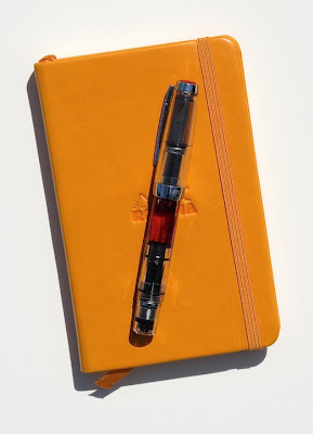
Tricks of the Trade -- Posting the Mini

what a delightful pairing!

As many TWSBI fans already know the Diamond Mini is the first pen from the popular Taiwanese manufacturing firm that was specifically designed to be posted. What you may not know, however, is that the Mini's threading system also allows for comfortable posting whether you use the pen in the upright position or the inverted position. Here's how it works.


First, while holding the pen, imagine a longitudinal line running from the nib to the filler knob.


When you intend to work with the pen in the upright position, begin the posting process with the clip placed to your LEFT of the imaginary longitudinal line. Thread the cap on till it is snuggly seated against the O-ring. (This will lock the clip up and away from the soft web of your hand.)


If you wish to achieve a finer line by working with the nib inverted, begin with the pen/nib in the upright position and the clip to your RIGHT of the imaginary longitudinal line. As described above, thread the cap on till it is snuggly seated against the O-ring. Now invert the pen and begin writing, drawing, or journaling.

Conclusion: the folks at TWSBI are engineering geniuses for producing such a marvelously versatile writing instrument, and financial wizards for offering it at such an affordable price.

____________________________________________________________________

Some parting thoughts --

1. "Flexing Your Muscle"

TWSBI's Diamond Mini is a delightful writing and sketching tool and the JoWo nib is smooth as silk -- in both the upright and inverted positions. So, what else could one ask for?

Well, some have said that a variable, more expressive line might be a nice option. And nib meister, Pendleton Brown, has been nice enough to develop his "Pendleton Point Bad Boy with Angel Wings Hot-Tip Butter-line Stub" and several other mod options.


I recently has the opportunity to "test drive" a 1.5mm stub that he had added both smoothness and flex to. The new nib units for the Mini weren't out yet and the 580 hadn't started shipping yet, so Pendleton was kind enough to loan me a 540 unit (which threads onto the Mini's barrel perfectly but is too large to fit under the cap) and the test results were quite enjoyable.

So, if you think you'd like to add even more smoothness and/or semi-flex to your 530, 540, Mini, 580, Vac700, or Micarta, check out Pendleton's site, drop him a line, or pop by his table at just about any upcoming pen show. You'll find that he's full of all sorts of fascinating information (that he freely shares with others) and a pleasure to visit with.

______________________

2. "When Is Red Not?"

the Mini's facets can make sunlight sparkle

Recently Larry Marshall and I have been discussing Saffron ink (from Caran d'Ache) on Cathy Johnson's AJW FB page. During the discussion Larry suggested that Saffron is a red ink and that it might be problematic as a drawing ink for architectural studies and urban sketchers. Well, as can be seen in the photos (and videos) above, Larry was right -- sort of.

It turns out that Saffron ink is very much like its floral namesake; in concentrated form it has a decidedly red appearance (and a beautiful translucent red appearance, I would add, when loaded aboard a TWSBI clear Mini). But, in its original state as a flower petal or when applied as a written or drawn line on paper, it takes on an equally beautiful but more distinctly orange hue.

As for its usefulness as a color for architectural renderings? Well, I recall that my alma matter (California College of Arts & Crafts) used a rendering of the school's Queen Anne-style administration building and towering redwood tree (in red ink) on their stationary for years. So I did a little test of my own to see how the Saffron would do. The results might not be for everyone. (Then, what is?) But for some it could certainly offer a warm and interesting alternative to the standard black.

(the pocket-sized Rhodia is great for jotting down notes and capturing a spontaneous "visual") 


What alternate colors work for you?

Friday, April 12, 2013

Cherry Blossoms, Workshops... and Free Kit!

sakura in bloom


One of the first signs of the pending arrival of spring each year are colorful blossoms of wildflowers, gardens, and fruit-baring trees -- followed by a flurry of workshops and sketching events as artists everywhere rush to shed winter-wear and begin another season of art-making outdoors.

this spiffy little carrying case clips onto a belt loop or D-ring,  has a waterproof center pocket for your pens & pencils, and a clear outside pocket just the right size for your "artistic license"

As in past years I'll be leading a series of local, regional, and national place-based workshops (some on nature journaling, some on travel journaling) and hope to see some of your smiling faces among the participants. And again this year I am fortunate to have the material support of some really remarkable art material manufacturers and distributers.

6 Microns in assorted sizes, 1 Pigma Brush, and 1 Pigma Graphic pen -- a perfect selection for your everyday carry!

In fact, thanks to the generosity of the folks at Sakura of America, two participants will be selected at random during one of my upcoming workshops -- with one receiving a Sakura Koi 12-color Pocket Field Sketch Box with two Sakura water brushes and a really nifty carrying case, and the second winner receiving an 8-pen Pigma set and Sakura pen case.

Stay tuned for more details soon.

Sunday, April 7, 2013

Exaclair, Part 1 (Tools of the Trade #8)


This week I will begin an in-depth review of inks, paper products, and traditional dip pen supplies that Exaclair, Inc. line of companies offer artists, calligraphers, pen enthusiasts, and paper lovers. 

Thanks to the generous support of Karen Doherty, Exaclair's Vice President for Marketing, I have an extensive selection of the company's products to work with. But I will begin by saying that my "sampler" is not exhaustive. The range of papers, working surface options, bindings, and sizes available in notepads/sketchbook/journals/stationary alone is amazing; there is literally something for everyone! (More on this later.)

To begin I have shown the subjects of this review above. They include: (top row) the hardbound Rhodia reporter's-style Webnotepad (measuring 3.5"x5.5") with dot-pattern paper; the Rhodia Webnotebook (also hardbound) in 3.5"x5.5" with blank paper; the Clairefontaine A5 (14.8 x 21cm) Notebook; a Brause "Kalligraphie" set; G. Lalo Verge de France stationary (5.25"x3.5"); and Rhodia (No. 12 & 13 Blocs and a 9x14cm Unlimited) ; (bottom row) Clairefontaine "Life. Unplugged" 9cm x 14cm & clothbound A5 journals (both the Roadbook with elastic closure & the Clarefontaine Basics); J. Herbin fountain pen inks; the Clairefontaine A5 "GraF It Sketch" journal (with its unique binding); and the clothbound Exacomta A5 Sketchbook.


Oops! I spoke too soon. A second package arrives with two more journals -- this time from Exaclair's Quo Vadis Habana line. Both are bound in the U.S. with fountain pen-friendly Clairfontaine papers -- 85g cream-colored blank pages in the 10x15cm notebook and 90g white lined paper in the 6"x9" notebook.

_______________________________________________________________

"Life. Unplugged. Takes you where no laptop can go."

Toss 'em in your backpack (or your pocket) and you're ready to hit the road!


As an artist who prefers to mix images and text in his journals, I'm not a big fan of ruled paper. But I have to admit that the 9 x 14cm Roadbook by Clairfontaine is brilliant! The 3.5"(ish) x 5.5" size fits perfectly into whatever is at hand, be it shirt, jacket or cargo pocket, sketch kit, or expedition backpack. The "plain brown wrapper" is deceptive. In fact, it is a very high quality (and I suspect water resistant) tan-colored binding with a surface texture that is quite pleasant in the hand and an understated but elegant embossed Clairefontaine logo on the lower right front. The front and back covers are scored to facilitate consistent opening and closing regardless of which page you're working on. An elastic ribbon is securely grommeted to the rear cover and acts to hold the notebook closed (and retain loose tickets, boarding passes, and other ephemera you may wish to deposit therein). Unlike the Rhodia Webnotebooks and Moleskine journals, the Roadbook does not contain an expandable pocket inside the rear cover. 

When's the last time that the feel of paper or simple act of writing made you smile?


Then there's the paper -- that wonderful, smooth-as-silk, 90g, pH neutral, acid-free, chlorine-free, fountain pen friendly paper that is synonymous with the name Clairefontaine. The paper is arguably the most fountain pen-friendly paper that is readily available around the world. It is organized into a four-signature, sewn structure that is firmly joined to the binding.

Because of its smoothness, I did have a slight reservation about how the paper would work with graphite. My concerns turned out to be unfounded, although I would probably opt to switch to 2Bs from my usual HBs to obtain a fuller tonal range.

This book's size and weight make it ideal as an everyday carry and perfect for jotting down ideas and observations on the fly -- especially if your writing instrument of choice is a fountain pen. (Feathering of even the wettest ink is nil, bleed-through is nonexistent, and show-through is moderate enough that writing on both sides of each sheet will be completely problem-free. I now use mine to jot down building names and addresses of new architectural finds (for my Little Texas series) during during scouting trips, to record project ideas (for new paintings and drawings) as quickly as they pop into my head, and as a catch-all for all of those fiddly bits that I so frequently decide have future creative potential.

______________________________________________________________________

"Graf it!"

the cover's score lines (indicated by the blue arrows) allow the open cover to lie flush with the sketchbook's surfaces

Two things struck me right away about the GraF It Sketch journal. First, the book is staple-bound in a way that resembles Japanese side binding. And, like Japanese books, the spine is on the right rather than the left side -- which makes it perfect for artists from cultures who write right-to-left and folks (like my wife and son) who are left handed.

my son was completely won over by the GraF it's ergonomic design, and the delightful feel of the Clairefontaine paper.
______________________________________________________________________


Tricks of the Trade -- 
#1.  If your lifestyle requires that you write on the go, but you use slow-drying inks and you want to avoid ink transfer between facing pages, cut a piece of blotter paper to match the shape of the Roadbook and use it as a handy bookmark.
#2.  Carry your Roadbook in a clear zip-lock bag to protect against both rain and excess scuffing.     

Monday, April 1, 2013

Tools of the Trade #7 -- Ink Spots (Greens & Purples + Conclusions)

the blue test swatches

As you may recall, I began the Ink Spots series in early December with a selection of blue fountain pen inks (see "Ink Spots"). At the end of December I expanded the test by adding a selection of reds, oranges and browns to my test window (see "Roses Are Red"). And this week I'm rounding off the test selection with test panels of greens and purples -- two of my favorite springtime colors!

The blues have been in a window with northern exposure (for the most consistent, indirect daytime light) continuously for 17 weeks (since December 3) and -- given that all of the inks tested consist of dyestuffs (which are usually thought of as far less permanent than pigments) -- and must say that I am quite pleased with the results.

All of the blues tested experienced some loss in intensity or brightness during the test. Two inks (Sheaffer Blue and Pelikan 4001 Blue) experienced some fading, while Pelikan 4001 Turquoise and Sheaffer Peacock Blue actually appear to have darkened in value.

Conclusion -- given that I have run similar tests on ball point and roller ball inks only to have some bleach out completely over the same time period, I find all of the inks tested to be quite acceptable for both letter writing and journaling applications, and for the creation of artwork intended for reproduction. Since most journalers do not intend for their work to be exposed to light on an everyday basis, any of these inks should (I think) be expected to last at least as long as the paper their used on.

the red/orange/brown test swatches

I began the red/orange/brown lightfastness test on December 31 and it has now run for 13 continuous weeks. Others have written about experiencing dramatic fading in the warm colors. So, of the three color groups I tested, this was the one that I expected to see the biggest changes in. Surprisingly, however, with two exceptions (one dramatic, one subtle), all of the inks in this test group retained their intensity, hue and values.

The subtle change was experienced in Sheaffer Brown, which I now suspect is an admixture of a low intensity green and a warmish (and fugitive) red or red-orange. Over the course of the test the latter color seems to have bleached out and the exposed portion of the sample shifted toward a slightly lighter olive drab.

The dramatic change occurred in the ink that was thinnest on the paper -- where I had splashed and then blotted up some Pelikan Red. The immediate effect of blotting the ink was that the remaining stain showed a noticeable shift toward a cooler magenta pink, while the eventual (very evident) effect of blotting was the near complete bleaching out of the splash marks on the exposed paper -- leaving something that looks a great deal like faded mustard stains.

Conclusion -- as with the blues, I think that any of the inks tested in this group would serve the letter writer, journaler, or illustrator well. And, taken as a whole, they offer a fine cool-to-warm range to select from.

the Green/Purple test swatches

Testing of the final group was begun on February 18 and has now run for 6 weeks. While this is probably not long enough for a definitive evaluation, I do already have several observations to convey.

First, the greens show no change whatsoever thus far -- in hue, intensity, or in value. Second, all but two of the inks in the purple group (Sheaffer Burgundy and Noodler's Cactus Fruit Eel) have shown marked changes; the Pelikan 4001 Violet has shifted toward red-violet, J. Herbin Rose Cyclamen has become a bright scarlet, and (possibly most troubling) Levenger __ and J. Herbin Violette Pensée both show signs of bleaching out.

Conclusion -- any of the greens (and there are an amazing range from which to choose) would serve well. (And, for the Romantics among us, it might be worth noting that green ink was Pablo Neruda's favorite for both correspondence writing and composing poetry.) Thus far the Sheaffer Burgundy and Noodler's Cactus Fruit Eel ( FYI, "eel" designates a Noodler's ink that has been formulated to "lubricate" the piston in piston-filler pens.) are fade/shift free.

The remaining purple/violet inks will be watched carefully for the next 10 weeks or so and an update will be posted if significant changes are observed.  

___________________________________________________________________


"Why didn't you place the test swatches in direct sunlight?" 

I will never knowingly expose artwork to direct sunlight. Even on those occasions when I've been asked to create outdoor murals I've used the most lightfast materials available AND made certain the work had a northern (indirect lighting) exposure. So, I see no advantage to what I consider an unrealistic test. For wall hangings I will continue to choose pigmented inks. But for journaling, correspondence, and reproduction work I am quite pleased with the amazing range of water-soluable inks we have to choose from. 

That said, I will add that there are probably other testers who will disagree with some or all of my choices and methodology. And, of course, testers who are closer to the Equator will likely have swatches that are exposed to even more sunlight (possibly even direct sunlight) than mine. I recommend that you read over their test results too, and then draw your own conclusions. (And feel free to share your own findings and observations as comments. More accurate information will certainly mean better decision-making for all of us.)


Cheers!