Tuesday, January 15, 2013

Zeta

Zeta -- the sixth letter in the Greek alphabet, the middle name of my favorite Welsh actress, and now a new series from the premium artist's sketchbook publishing firm of Stillman & Birn.

Zeta -- Stillman & Birn's latest paper development (coming soon to a sketchbook near you)

While Stillman & Birn's widely acclaimed Beta and Delta Series have provided the artists community with two outstanding watercolor sketchbooks, Michael Kalman has stated that the company (not satisfied with merely resting on its laurels) is constantly evaluating the needs of artists/journalers and asking how their line of sketchbooks can be improved to better serve those needs. With invaluable input from experienced artists like Jamie Williams Grossman, it was decided that there was just such a need for a multimedia sketchbook with a paper weight similar to the Beta Series but with the pen-friendly surface of the Epsilon Series.

The folks at Stillman & Birn then turned to the same European mill that had done such a brilliant job of developing the papers for the company's five existing sketchbook lines and, after months of testing and evaluation, the new Zeta Series was announced.

In December  Michael Kalman asked me if I would be interested in trying out some of the pre-production Zeta paper. (I know what you're thinking -- artist auto-response: "Is this a trick question?") And, of course, I jumped at the opportunity! Michael promptly sent me a batch of 8 5/8" x 11" sheets that seem to me very similar in proportions to a two-page spread from the 5.5" x 8.5" sketchbook I tested previously (see Road Trips, Hot Rods... and a Road Test for my observations and images from that review). So, I decided to mock up a series of double-page spreads based on my recent trip to the Gulf Coast utilizing a variety of wet and dry media, including: pencils, fountain pens, fine liners, watercolors, and color pencils. What follows are some of those sheets, my notes, and observations. I hope you find them useful.


the mockup of the inside front cover of a sketchbook (I always begin each sketchbook 
with a quotation, this time from Ocean Springs' native artist/naturalist)

The Zeta Series paper is the same weight as that in both the Beta and Delta Series but, because it has been run between rollers, it is thinner. (The term "Hot Plate" has its origins in the practice of ironing the paper smooth or running the still-damp paper sheet between two heated rollers under high pressure.) Zeta is actually smoother than Arches HP watercolor paper, though not quite as smooth as a Plate finished Bristol paper.

the Mississippi Gulf Coast -- old tugs, sea birds, and the world's longest man-made beach

There is just enough "tooth" to the paper's surface to provide feedback and the paper responds wonderfully to the most delicate nuances with pencil. Graphite bonds well with the paper's surface but does not build up as rapidly as on the Beta. (When working across the entire surface of the Beta I found it expeditious to use a sheet of barrier paper between my hand and the graphite to avoid excessive smearing.) Thorough erasing was readily possible on the Zeta. A firm pressure on a vinyl eraser would remove all signs of a pencil's mark without disturbing the paper's fibers or marring the surface in any way. 

I used a wide range of pens and inks during my evaluation of the Zeta -- including four fountain pens loaded out with both water-soluable and indelible inks, and a variety of Micron permanent pens. As on the Beta paper, the Micron pens performed flawlessly and without fuss.

with careful pressure control, Zeta handles an amazing range of dip pen nibs 
(and Microns and fountain pen nibs with ease) 

If you read my Beta review you will know that one of my few concerns about that paper was that the toothiness of the hard Cold Press surface might be a bit too abrasive for long-term use with valuable (gold or platinum) fountain pen and dip pen nibs. Well, Stillman & Birn has certainly resolved that issue with the Zeta Series. (Viewed with the aid of a high-powered loupe, the surface of the new Zeta paper has a very fine, even felt-like appearance.) I got just enough feedback while drawing with a Pelikan 120 (the first pen I used) to feel free to use my widest pressure range -- producing delicate details and bold shadow effects. The paper also responded equally well to my semi-flex Eversharp Symphony -- the pen that raised concerns about excessive abrasiveness when used with the cold press Beta and Delta Series papers. (This time, no concerns.)

Emboldened by my results I achieved with fountain pens, I decided to push the paper to the max and see what could (or couldn't) be achieved with dip pens -- which, because of their general lack of any iridium tipping material, are notorious for burrowing into paper surfaces on upstrokes and occasionally even skipping and splatting ink during sidestrokes.

The first dip nib I tested was a  Hunt 512 "spoon" which, because of its curved nib, navigated the paper in all directions without fault or complaint. Next was a nice flexible Hunt 103 that did quite well as long as I used gentle pressure on the upstroke and "listened" to the nib's feedback. Equally good results were achieved with a stiff Hunt 102 & 101, and truly remarkable hairlines were obtained with the lightest of pressures using a Hunt 108 "wet noodle".

Thanks to the weight of the paper are the uniform strength of its sizing, the buckling or warping of the paper experienced after the application of watercolor washes was minimal.

dyes are much more notorious for staining than pigments but still lift well on Zeta paper
(the Carbon Black and Micron are permanent pigmented inks)

One cautionary note: Zeta is a marvelous paper for what it is. It's pH neutral, acid free, chloride free, and 87% alpha cellulose. It's archival and it's resilient. But Zeta is not long fiber rag paper. And I discovered (during a "lift test" of permanent inks) that it doesn't take much scrubbing with a watercolor brush to start lifting small (actually very small) fibers from the paper's surface. So, when "lifting watercolor or water-soluble inks I recommend caution. And, at the first sign that the paper may be starting to break down, you might want to stop.

On the plus side, the paper seems to be so heavily sized that -- once dried -- the tooth of the paper was only raised slightly (to about that of Arches HP paper) and the integrity of the paper did not seem to be compromised. (However, I prefer to err on the side of caution and would not try lifting color in the same spot a second time.)

The paper's heavy sizing also meant that lighter inks, like the vintage Sheaffer Peacock Blue, sat on the surface and retained their full brilliance, while the lack of feathering meant that a line laid down by an Extra Fine (or finer) nib remained equally fine as it dried.

results after a single wetting and lift in the center

I also performed a lift test with a selection of my watercolors (not an exhaustive selection, but a good cross sampling of artist's grade pigmented colors) -- and I wanted to determine if my choice of brushes might have had anything to do with the paper lifting that was experienced during the ink lift test. So, for this test I applied color with the same water brush I'd used for the ink lift test. But, instead of using the water brush to lift as well, I switched to a soft squirrel mop to re-wet the center section of each color sample and then used a clean, dry rag to mop up the color. The results were truly remarkable -- and no fibers were lifted this time.

The Zeta Series is set to be offered in the same sizes and binding options as both the Beta and Delta Series, although I'm still holding out hope that at some point in the future S&B will decide to add a hardbound landscape format as in the Alpha Series. (What can I say? I think there's a great deal of creative potential for the "oriental" elongated horizontal or vertical double-page format.)


Zeta is brighter and cooler than Arches HP 

The Series was originally scheduled for release in mid-January 2013. However, Michael recently stated that, due to certain unforeseen circumstances (given that Stillman & Birn's offices are located in New Jersey, I wouldn't be surprised if Superstorm Sandy was one of them), distribution might be set back to sometime in February. Either way, it's not too early to check with your favorite art supply dealer and see how soon you can place your order for a Zeta of your very own; you're certain to enjoy the results!

And, until next time, happy sketching everyone!  

______________________________________________________________________

Blue inks update: the blue ink test samples that have been in the north-facing window for 4 weeks now are still showing no marked fading (quite remarkable). But I do have one unusual development to share with you this week.

old ink (red arrow) appears black straight-on but has a red sheen if viewed from an angle, while the new ink (blue arrow) is more intensely blue (both the "old" an "new" are from the same bottle)

During a routine writing test of Waterman's vintage Florida Blue I discovered that (as my test pen neared the last of it's ink) the writing got darker and (when dry) develops a noticeable reddish sheen. This phenomenon was observed and recorded while I was in the midst of writing a letter. Mid-word I ran out of ink and noticed, upon refilling the pen and resuming my writing, that it looked like I was using two completely different inks. I can only speculate that, over time, the dyes that make up Florida Blue separate out in the pen's bladder. (It is worth noting here that the pen in question was obtained with a brand new ink sac installed and Florida Blue is the only ink to date that it has been loaded out with.)

Sunday, January 13, 2013

And the Winners Are... #4 & 5

OK, we did the blind drawings on Friday, notified our winners yesterday, and they've both emailed me back. So, without any further ado...

[Virtual drumroll]


The winner of the Noodler's Ahab Burmese Ruby fountain pen is Serena A. in Minnesota.


And the winner of a copy of The Handcrafted Letter is Cindy B. of New York.

I'd like to thank everyone who participated in this contest. I hope you all had fun and that you'll join me for another giveaway soon. In the meantime, please join me in congratulating our lucky award winners. (Ladies, your prizes will go out in tomorrow's post.) And stay tuned for a new article (with new art and a new product review) shortly. (I think you'll find it interesting.)

Cheers!  

Monday, December 31, 2012

Snail Mail, Vintage Post, ... and Thou

(pen work by Charles Dana Gibson)

For the past decade rekindled interest in fountain pens has been steadily growing. People who have grown weary of the high speed, never stopping - never pausing, race toward the Future that is the 21st century pace of things just might be robbing them of something: the experience of the beauty and wonder of the Here and Now, the experience of Life.

if you can't think of enough to say, a favorite verse,  

... a sketch, or an inspirational quote may be just the thing


Some artists who have felt a disconnect with the impersonal digital word of the machine have found limitations in the world of pixel-based images and have renewed their acquaintance with old, almost forgotten, friends -- pens, pencils, and paper.

you can't put a ribbon around a bundle of emails 
(I also bought my wife a large, decorated German tin for her cards & letters) 

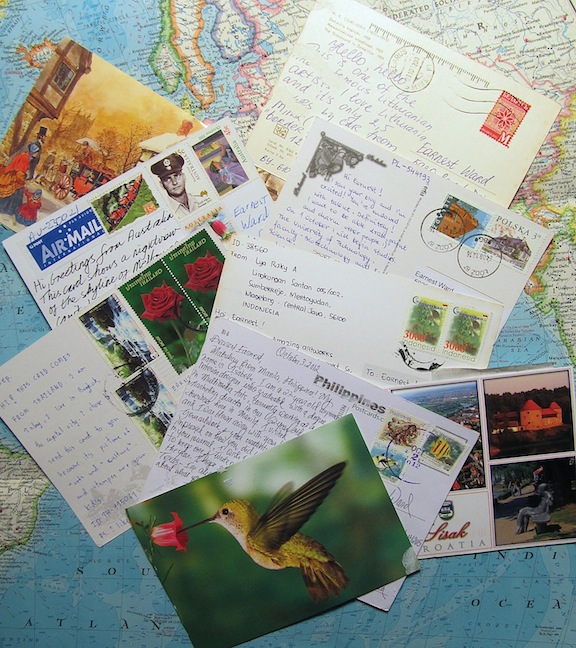
Some who have recently renewed their acquaintance with fountain pens -- not being satisfied to merely collect them as relics of another time, or as commodities -- have discovered that they can be invaluable allies in Slow Living -- a philosophy that grew out of the Slow Food movement in Europe that builds on the premise that we can do less and experience more (very much like the Arts and Crafts Movement's emphasis of Quality over Quantity). Snail mail has made a comeback and devotees are once again taking pen in hand to reconnect with friends, relatives, and (through groups like the Fountain Pen Network) with new pen pals in faraway places. Concerned you can't think of enough to fill a letter? Start out with postcards; they're fast and easy. Groups like Postcrossing will be happy to match you up with postcard pen pals from around the world (free of charge).

Russia, Poland, Thailand, Australia, Croatia, the Philippines, Argentina, 
Indonesia, the UK -- less than two months worth of postal globetrotting (fun!)

And another interesting phenomena has arisen; A) someone discovered that (at least in the United States) unused postage stamps never expire, and B) there are enough vintage postage stamps on the market that they can actually be had for a reasonable price (sometimes for little more than their original face value).

vintage stamps can be found in various sizes, colors and themes 


these sets, and others, are available from Etsy vendors, such as Verde Studio


a hand-written letter like this in my mailbox wins hands down over my digital inbox anytime

So, if you have a fountain pen (or maybe even a dip pen) with an expressive, nice-writing nib -- And if you have the skill to address the envelope in a fine Spenserian or Copperplate hand -- why not indulge yourself in some pen-friendly stationary, dust off your old address book, sit down and write to that best friend from high school or college you haven't seen in years. (Or your mom -- when is the last time you wrote your mom?) Add a few reasonably priced vintage stamps. Seal the envelope with sealing wax and your old signet ring. (There are even new polymer sealing waxes that are "postal proof".) And let Ben Franklin's postal service do the rest. The results could very well be magical!


this year I even took time to renew the acquaintance of ol' Saint Nick
(everyone likes to receive a hand-written letter!)

Postscript, if vintage stamps aren't available in your area and those available on Etsy are a bit too pricy, just visit your local post office. They're certain to have a selection of new and commemorative stamps (my current favorites are Miles Davis, Edith Piaf, and -- my wife's favorite -- a very dashing Gregory Peck) for you to choose from.

_____________________________________________________


Giveaway #4:
You say your handwriting is atrocious? You say you were born in the 90s and have no idea how snail mail works? Well, that sounds like an excuse for another grand prize giveaway to me! This time our lucky winner will receive a copy of  Diane Maurer-Mathison's beautifully illustrated how-to book, The Handcrafted Letter. So, sign up by clicking the blue "join this site" button on the right (if you haven't already done so), and leave a comment including the words "Handcrafted Letter" below between now and Friday, 11 January. The winner will be selected at random and notified via personal message on Saturday, 12 January. And the results will be posted here Sunday, 13 January.

not quite new, but gently used

Giveaway #5:
You say you'd love to send hand-written letters to friends and relatives but you don't have a fountain pen? You say your discretionary funds are too depleted to indulge yourself? Well, Santa just may have left a little something under my tree with your name on it! In the spirit of the Santa Season I've got a Burmese Ruby red Noodler's Ahab that will be forwarded to one lucky would-be penman (or woman). So, to enter the drawing be sure to join this site (see instructions for Giveaway #4 above) and leave a brief comment about why you would like to win this pen. Dates are the same as for Giveaway #4.

Please note: participants are welcome to leave a separate comment for each of the giveaway prizes, but a separate winner will be selected for each prize.

Good luck!

Parting words (a little visual reminder from the cast, and director, of one of my favorite feel-good films that not so long ago everyone wrote beautifully...)

(...and everyone carried a fountain pen)


Friday, December 28, 2012

Road Trips, Hot Rods... and a Road Test


Posit: Americans are in love with the open road. Posit: Americans love their cars. (And so do the Swedes, who I am informed actually own more classic American "road yachts" than anyone else.) Jack Kerouac wrote about road trips, and so did John Steinbeck. Teenagers dream of hitting the open road and going in search of America. Affluent retirees buy motor homes and spend their Golden Years exploring this land that Woody Guthrie said belonged "to you and me". And the rest of us look forward to holiday breaks from jobs and other day-to-day commitments so we too can hit the road (maybe with Nelson Riddle's theme from the old "Route 66" TV show playing in our head).

We hit the road, on a whim or on purpose, but never so much as during our major holidays. So, this Thanksgiving "weekend" my family and I headed to the Gulf Coast and my wife's family: a chance to get out and away; to catch up on the year's news with cousins, aunts, uncles, grandparents; and to see how the post-Katrina reconstruction has progressed. I enjoy the drive (if I can do it during daylight hours) because both the geography and the scenery gradually change as we make our way east and south; open grasslands give way to pines, then to vast rice fields, then to the Atchafalaya Swamp (a magical place that haunts my artist's imagination, and that I promise - to myself, if no one else -- to dedicate an entire sketchbook/journal one day), back to pines, and finally giving way to twisted oaks, Spanish moss, and the longest man-made beach in the world.


View Driving directions to Gulfport, MS in a larger map

The morning after arriving on "The Coast" I leave my wife to catch up with her family, and my children to play with their cousins, and I venture out -- "to recharge my beach batteries" and to see how the recovery following Hurricane Katrina is progressing. This adventure usually involves driving over to my old neighborhood on 2nd Street in Gulfport, then a relaxing drive east along "the beach" (on Highway 90 -- one of the top two coastal roads in the country), and ending up in Ocean Springs -- a beautiful little time capsule of a town whose downtown is a gentrified snapshot of life in the 50s and 60s, and my favorite coastal community.

Well, my beautiful old house with its wonderful hardwood floors and regional shotgun architecture is gone (washed away by the storm) replaced, if I counted the lots correctly, by a new code-compliant house on stilts. But several of the lots are still vacant (and probably will be for many years to come) and in one I found a beautifully restored 1953 Cadillac Eldorado convertible -- which, of course, I had to stop and sketch.

a classic from the Golden Age of the American-made "land yacht" (in quintessential candy apple red)

The beach drive doesn't offer much landscape for sketching -- just a long horizontal and the soothing harmony of clear blue sky and warm creamy, ochre/orange-tinged white sand. But, combined with the maritime breeze, the gentle lapping of the Gulf waters, and temperatures warm enough for shorts and a brilliantly colored Hawaiian shirt, it can be sublime... and a birders paradise.

Waterman Florida Blue and Pelikan Red on Fabriano Ingres paper 
(pre-cut to carry in the Stillman & Birn sketchbook)

(My leisurely stroll around downtown Ocean Springs -- and an illustrated review of a new paper line from Stillman & Birn that I think you're going to find very interesting -- I'll save for a separate post in the near future.)

And, on the return drive west I alternated between stops (to record some of the man-made landmarks that survived the storm but that will eventually be claimed by the corrosive salt air or the developer's bulldozer) and side trips into some of the small neighborhoods off the beach to see how far along their recoveries have come.

watercolor over micron and graphite on S&B Beta Series paper

Among the more surreal sights I encountered was a Bofors 40mm twin anti-aircraft gun system just west of the Biloxi Yacht Club. Before Katrina, the guns served as a monument to WW II veterans and stood in front of one of the area's VFW lodges. Now, however, they stand as sentinels -- alone and forlorn -- before a vast, empty, overgrown lot. The guns withstood the force of the tidal surge that swept away so many of the buildings but, having been completely submerged by the storm's record high tide, are now being slowly reclaimed by neglect and the corrosive action of the salt water.

the rugged Beta paper handles erasures and corrections with ease 

the paper handles washes with ease & color rides high on the surface, 
remaining just as bright when dry as it was when wet

In one of the small neighborhoods, in from of a tiny mom-and-pop grocery store, I also spotted a beautifully finished ("restored" would not be the proper adjective here, I think) Chevy pickup truck. It was highly modified (to say the least) but as best I could tell it started out as a 1936 model -- and was a delight to behold!

OK, I think this has been my most "literary" posting to date. Next week I'll almost certainly return to my more normal model (more illustrations, fewer words). In the meantime I hope you're all enjoying a wonderful holiday season, and getting in lots of sketching of your own.


a little driving home music

________________________________________________________


Test Drive: Some time back Michael Kalman, co-owner of Stillman & Birn, kindly offered one of the company's Beta Series sketchbooks for me to review and evaluate. So, I decided to take advantage of our Gulf Coast road trip  to do a little "test drive". All of the images produced for this week's blog article (with the exception of the pelican) were produced in the Stillman & Birn journal and the following are my observations and thoughts.

this set slips perfectly into my day kit (with plenty of room for watercolors and color pencils)

Structure: Stillman & Birn journals are available in two bindings: a sewn, hardbound structure with rigid spine; and a hard-covered, spiral-bound structure. This review will focus on the qualities of the first type of structure.

The front and rear cover of the binding use remarkably thick, rigid boards that will easily withstand the rugged conditions that face the outdoor adventurer and keep safe the notes and observations lodged within. Careful attention has been paid to details in the journal's construction. And the rear cover has been deeply imprinted with both the company's logo and the name of the sketchbook series.

the elegantly rendered imprinting on the rear cover is a perfect match 
for the leather-like finish of the binding  

One drawback to some hardbound sketchbooks is their inability to lay completely flat when opened (and this can be particularly problematic when doing a two-page spread in watercolor as washes will tend to puddle in the "gutter" between the pages). Stillman & Birn has resolved this issue in their sewn structures through the design/construction of the journal's spine.

the flexible inner spine is the secret to the Beta Series' ability to lay remarkably flat 

If you lay the spine flat on a table and then proceed to open the journal to a pair of inner pages you will observe that, as the front and rear covers are lowered to the table surface, the sewn section rises up and away from the hardboard spine of the binding. By the time the pages are fully open the pages are laying completely (or very nearly) flat, with little of no "gutter" to speak of. I found this feature outstanding.

Paper: While Stillman & Birn do not manufacture their own paper for this series, they have researched their options carefully and chosen very well. The paper is a remarkable 180 lb./270 gsm. (That is, for example, 40 lb. heavier than the most popular watercolor paper sold by Arches, and 70 gsm heavier than the paper used in the Moleskine watercolor journal.) The paper is archival, being pH neutral, acid free, lignin free, and chloride free. The paper has been heavily (and very evenly) sized both internally and externally, so that washes result in little or no buckling of the page, colors remain on the surface, are vivid even after drying, and (when necessary) can be readily "lifted" to make corrections. It also has a Cold Press surface with a texture that falls between Arches CP (Arches CP is more textured) and Arches HP (this time Arches being slightly less textured).

even after a full minute of nib contact feathering was virtually nil with water-based inks

Show-through/bleed-through: Before I hit the road I wanted a clear idea what I could (and couldn't) expect from this sketchbook. I turned to the last page of the journal and ran a torture test with six pens and both water-based and alcohol-based inks. With each pen/ink combination I held the pen point to the paper for a series of pre-set periods of time and then observed any indication of feathering, show-through, or bleed-through. What I found (see illustration below) was that the paper's sizing prevented both feathering and bleed-through of all water-based inks -- even when the nib was held in place for a full 60 seconds! The alcohol-based Sharpie ink in the thick-felted large marker was a completely different story; feathering (the horizontal spreading of the ink) could easily be observed with the eye, show-through occurred at the 1 second mark, and bleed-through began at 5 seconds. In fact, bleed-through actually marked a second page at 30 seconds, and bleed through the second page at 60 seconds. (In fairness to S&B, the Sharpie test was intended to determining the Beta Series' outer parameters and I doubt many journalers will find the large Sharpies practical drawing tools in any sketchbook.)

Format: At this time the Beta Series hardbound is available in three popular "portrait" format sizes (8.25x11.75 in. (A4), 8.5x11 in. and 5.5x8.5 in.), but not currently in "landscape" format.

Pros: The Beta Series are built very well and will easily hold up to whatever the artist/voyager may throw at them. The binding is thick and rugged and will provide excellent protection to the treasures within. The structure lays flatter than most hardbound sketchbooks, making double-page images a workable option. The stitching is flawlessly done (with heavier thread and more stitches than some competing brands) and will handle repeated openings and closings with ease. The paper is sturdy, thick and heavily sized. The paper's surface is just abrasive enough that it responds well to even the lightest touch of a pencil (thus providing the maximum value range possible with pencil) and handles most media -- both wet and dry -- exceedingly well. When working with wet media, color sits on the surface, retains its full intensity, and can be readily lifted when needed. And little or no buckling is produced when watercolor or ink washes are applies.

There is absolutely no show-through or bleed-through with normal sketching media and techniques. So one can use both sides of each page with confidence.

And, if the snowy white of the Beta Series is too bright for your personal taste, the folks at Stillman & Birn thoughtfully offer the Delta Series -- same surface and paper weight in a subtler creme color.

Cons: When new, the structure does not lay completely flat when open so a little time must be taken to "soften" the spine (by repeatedly opening and closing the book) or some care must be takes when working with washes to avoid puddling in the gutter, and photographing/photocopying finished works that cover a two-page spread may be more challenging. Avoiding this issue is easy if one simply follows the recommendation found on the company's website; open the book to a series of pages, beginning at the front and proceeding to the back, until the facing pages lay completely flat. Repeat this process until the structure lies flat when open and has lost its tendency to spring closed. When the book opens and closes without resistance you're done.

Unlike the Alpha and Gamma Series, the Beta Series is not currently available in a horizontal "landscape" format; this may not be an issue for some, but personally I like the unique creative potential that is offered by the elongated double-page spread -- whether used horizontally or vertically. While the Beta handles fineline markers with ease, the feathering and show-through/bleed-through experienced with the Sharpie marker would lead me to suggest caution when using alcohol-based markers and probably to recommend using only one side of each page when using this kind of medium. (If you're a marker devotee you might even want to utilize a piece of loose barrier paper to prevent bleed-through from one page from spoiling the next.)

While I had no difficulty using a fountain pen and fountain pen ink, the paper's surface is just abrasive enough that I caution against using vintage or gold nibs; I limit myself instead to Microns and modern stainless steel-nibbed fountain pens. For an even smoother working surface experience -- one that will easily handle watercolor AND the most sensitive pen nib -- watch for the arrival soon of Stillman & Birn's new Zeta Series: 180 lb./260 gsm weight but with a Bristol-like Hot Press finish that is perfect for even the most detailed renderings. (I have received a few sheets of this delightful paper for testing, so you can expect a full review with illustrations in the very near future.)

If you (like me) are in the habit of depositing found objects and flotsam from your adventures in your journals, you may miss this elastic closure commonly found on Moleskine and Rhodia journals. Solution -- recycle the heavy rubber band than comes with you broccoli and other bunches of veggies from the green grocer's. And an envelope (either no. 10 or notecard sized) tucked inside the rear cover will keep receipts, wrappers, and the odd piece of exotic ephemera safe and sound till journey's end.

feathering test on the Beta Series paper

In conclusion, while some companies in the sketchbook/journal industry seem at times to base their sales on hype and the names they can drop, rather than the quality of their product, this relatively new line is clearly set to earn their reputation by offering the artist/journaler a sketchbook constructed of quality materials and crafted to last.
_________________________________________________

Am I Blue (Week 3): This is the second update of the lightfastness portion of our review of blue fountain pen inks (sorry, no post last week) and I am very pleased to report that (as can be seen in the photo) there is, thus far, no noticeable change in the hue or intensity of the inks, although (contrary to what one might expect) the Sheaffer Peacock Blue ink that has been exposed to sunlight (and we've had plenty of that) may actually be getting a tad darker.

lightfastness results after 3 weeks


I will continue to watch the test card each week for any sign of fading or shifting but, in the interest of brevity,  I will wait until the 6th week to make my next fade test update (unless there are any unexpected developments).

Monday, December 10, 2012

Let's Talk!

post fresh of the mail boat

If you've been following my blog for awhile you may remember  an article entitled "How Art Helped Save A Post Office" and, if you were a follower of my earlier blog you may remember my posts from the tiny hamlet of Stehekin, Washington, during my spring and fall 2011 residencies with the North Cascades National Park Service. If you have only recently joined us at "Drawn to Life" then you might not be familiar with the little town in central Washington state and may be unaware that there is no outside road access to the community, or that this time of year the ferry/mail boat only makes the 50-mile trip from the "outside world" 3 times a week, or that Stehekin is gateway to hundreds of square miles of some of the most beautiful, pristine mountain wilderness anywhere in the world.

the view (springtime) from just off Stehekin Landing (morning commutes can be such a drag)

But that's not why I'm writing this week's article. Last year about this time artists from all around the world (mostly human -- plus one pachyderm in Thailand) mailed in art as part of a concerted effort to save the local post office from closure (a pretty big deal to a community with no TV, radio or cell phone reception, no landline telephone service, and that even receives its library books via snail mail from the county library over 50 miles away). Two things came of the effort: the post office stayed open; and the town's artist community made 140+ new friends around the world.

the Lady Express mailboat (shown here in summer) will deliver all entries

Well, this year the Stehekin artist community would like to renew their snail mail dialog with artists in the outside world. (FYI, to the folks in Stehekin everyone outside their valley lives "down lake".) They have installed their own winter exhibition at the Golden West Visitor Center Gallery, are posting two pieces from the show each week to a website (with a little biographical information about each of the artists), and are inviting artists and writers/calligraphers from around the world to join them in a visual and/or written dialog. There are no entry fees and no expenses (other than the cost of postage) but please note that submitted works (which will be posted in the gallery AND on the groups website) cannot be returned.

the Golden West Visitor Center and gallery (built 1927)

So, if you're interested, take a look at the Stehekin site (don't forget to revisit from time to time as newly submitted work will be posted regularly on their "Stehekin in the World" page), and drop your work in the mail. If new works inspire a response feel free to submit multiple works.

Cheers!

Sakura Brush Pen Update: Well folks, this a first for me -- a giveaway prize has actually been declined. So, I've done another drawing for the brush pen and accessories kit, contacted our new winner, and the gift package from Sakura is now on its way to Newnan, GA. Please join me in congratulating Janet B. (And watch for another giveaway very soon!)


Blue, Week #1: OK, it's been one week since I put the blue lightfastness color chart in my north-facing window and the "control strip" in a dark drawer of my taboret. (Reminder -- I will be posting updates weekly for 6 weeks.)

week #1 -- no observable change

Tuesday, December 4, 2012

Tools of the Trade #5 -- Ink Spots (The Series)

no, not those Inkspots (but if you don't know their music you owe it to yourself to go here) 

Over the weekend I received a delightful package from the folks at The Goulet Pen Company. The packages contained an assortment of 14 fountain pen ink samples (to add to my collection of 18 other fountain pen inks I already had), a business card and book marker -- a really nice book marker (one is included free with every order, and that's quite appreciated by those of us who are also bibliophiles), 2 ink syringes... and a grape-flavored tootsie pop miniature (in a blue that appears identical to that on the company's logo).

yummy!

I am beginning a new series of articles reviewing some of the inks that have been made specifically for use in fountain pens -- mostly modern day inks, but occasionally a bottle or two of vintage ink that I've come across during my travels and adventure. Each article will focus on inks of a specific color from several different manufacturers, will evaluate the selected inks' specific color/hue, intensity, shading, flow, drying time, water resistance, propensity for staining and creeping, and light fastness*.

FYI, I'm told that's Diamine Presidential Blue in the Goulet logo "blotch"

This week (in the way of a salute to the crew at Goulet) I will start with blue, eight blues to be precise: Waterman Florida Blue (vintage), Parker Quink (vintage), Sheaffer Blue (vintage), Campo Marzio Roma Azul Marino, Pelikan 4001 Blue, Pelikan 4001 Turquoise, J. Herbin Bleu Pervenche, De Atramentis Steel Blue, Levenger Cobalt Blue, and Sheaffer Peacock Blue (vintage).


lightfastness chart (updated Dec. 7)

For the light fastness test I have created a panel on Arches 140 lb./300 g/m2. The panel has been cut down the center and the right section will be place in a north-facing window for the next six weeks (* that's intense, mostly cloud-free north Texas sunlight). I'll also post a weekly update here to document what, if any, effect the UV exposure is having.

Vincent Van Gogh's sketch of fishing boats

While I was in grad school one very memorable conversation I had with one of my art history professors revolved around Vincent Van Gogh's gorgeous pen and ink drawings. I went on about how I loved the effects Vincent achieved with his homemade reed pens, and how beautiful his brown ink was... and I was absolutely floored when my instructor said, "Well, you know that ink was actually purple when he drew them don't you?" That was the day I learned that not only were some dyes subject to fading (fugitive) when exposed to UV light but that some dyes also change over time simply because of their chemical composition.


drying time/smudge chart (updated Dec. 7)

For the drying time test I drew a chart with a series of lines for each ink. The ink lines were then checked to see if they would smear at intervals of 1, 5, 10, 20, 30, 45, and 60 seconds. Pelikan Turquoise and Sheaffer Peacock Blue had the shortest drying times at under 10 seconds (very useful for left-handed writers, like my wife and son, who want to reduce the likelihood of smudging) while the J. Herbin ink had the longest drying time at just over 30 seconds. Four of the inks (Parker, Sheaffer, De Atramentis, and Levenger) shared drying times of just over 20 seconds, while three (Waterman, Campo Marzio, and Pelikan Blue) were just over 10 seconds.   

dye separation in one re-wet and mopped ink

Most fountain pen inks are made up of water soluble dyes rather than pigments, and many of these inks are a complex mixture of several dyes -- some more soluble than others. The photo above shows a tissue that was used to blot an unknown brownish-purple ink that had dried up in a vintage rotting Art Pen. (Note that there appear to be at least four different dyes in this one ink!

separation chart (before)


separation test (after) (updated Dec. 7)


To do the dye separation test I first created a chart on Stratford 400 series calligraphy paper. Next I dripped water on the dried ink, being careful not to disturb the ink with the brush. I observed that the Waterford, Parker, Sheaffer, and Campo Marzio all lost considerable intensity after re-wetting as much of their dyestuff was absorbed into the paper's fibers. I also noticed that the Campo Marzio shifted toward lavender after re-wetting and, while the Levenger lost none of its intensity it did develop a decidedly purple ring after re-wetting. (I added Sheaffer Peacock Blue -- another Turquoise -- to the separation test on Dec. 6, with an undiluted drop on the left and a re-wet dot on the right. Like the other two turquoise, there was no noticeable color separation and intensity remained very strong.)


separation test (reverse)

On the reverse side of the separation test chart it could be readily observed that red dye had separated from the blue and soaked into the paper from the Parker and Campo Marzio Roma. And, while there had been no bleed-through during the initial inking, the Pelikan Turquoise, J. Herbin, De Atramentis, and Levenger all soaked through after the re-wetting.

In conclusion, Levenger's Cobalt Blue was the hands-down winner for sheer concentration of dye in their formula. (In fact, Levenger users could very likely increase the color intensity of this ink by expeditiously experimenting with the addition of small quantities of distilled water to increase the ink's transparency.) The J. Herbin, Pelikan Turquoise, and vintage Sheaffer Peacock Blue tied for color saturation and intensity straight out of the bottle. The De Atramentis offers fantastic shading -- from a brilliant try blue when applied thin to near-black when thick (a great candidate for wet nibs and signature pens). And the old classics (Waterman, Parker, Sheaffer Blue, and Pelikan Blue) offer flawless/skipless service and reliability for fountain pen lovers looking for a more traditional (maybe slightly "quieter") blue.

The J. Herbin appeared to be slightly more viscous in the sampler bottle/pen than the others. But none of the inks in this test batch gave any indication that they would be a staining or cleaning problem (think Baystate Blue maybe) for pen owners. 

At the end of next week's article, and each week for the next six, I will post a photo and progress report on the blue fade chart. Look for another ink review (on reds, oranges and browns) in 2-3 weeks. (I'll be alternating the ink reviews with other subjects and themes.) In the meantime please feel free to post any questions you have regarding this ink selection, or specific inks you might like to see in future reviews.

Cheers!


I thought I'd close with another piece of retro technology (watch closely and you can see the drive mechanism at work on the right)

Sunday, December 2, 2012

And the Winner Is...#3


Wow, we're really getting blind-drawing giveaway thingee down to a fine science. (No, let's make that "fine art". It sounds more appropriate to this audience, don't you think?)

We received a total of 27 comments/entries from which our lucky winner was selected and notified via email yesterday. And today I am pleased to let the rest of you know that our Sakura brush pen set (and accessories kit) will be going to Collecticat in Connecticut. (I'm glad I'm writing that instead of saying it as I haven't had my second cup of tea/caffeine yet.)

I'd like to thank everyone who participated and hope you'll join me in congratulating our winner. And I extend a special thanks to the folks at Sakura of America for providing our prize package -- and for producing such a marvelous range of art-making tools for us to enjoy!


I sincerely hope that you'll stay tune for future giveaways. (These are fun, so I'm going to try squeezing in one or two more before the end of the year.) And, in the meantime, I hope you will please join me again on Monday for a new informative, art-packed -- and, I hope, entertaining -- article.

Cheers!